No products in the cart.
AI SEO Data Visualization: Turning Complex Rankings into Actionable Insights
31
Jul
Jul
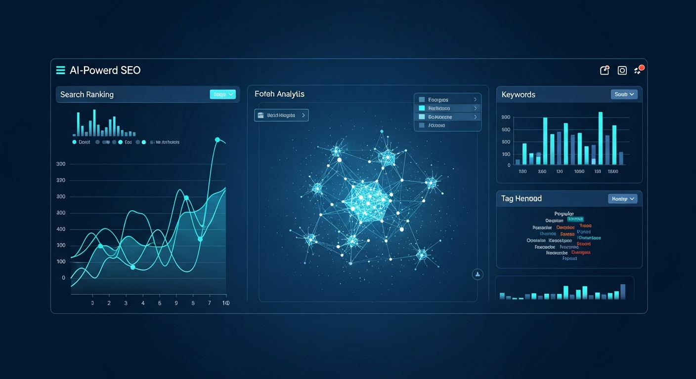
In the modern search landscape, data is abundant, but clarity is rare. SEO professionals are drowning in spreadsheets filled with keyword positions, backlink profiles, and Core Web Vitals metrics. The solution lies in AI SEO Data Visualization, a discipline that merges machine learning algorithms with graphical representation to make complex datasets instantly understandable. This approach does not just create pretty charts; it uncovers hidden patterns, predicts ranking fluctuations, and translates raw numbers into strategic decisions that drive organic growth.
What is AI SEO Data Visualization?
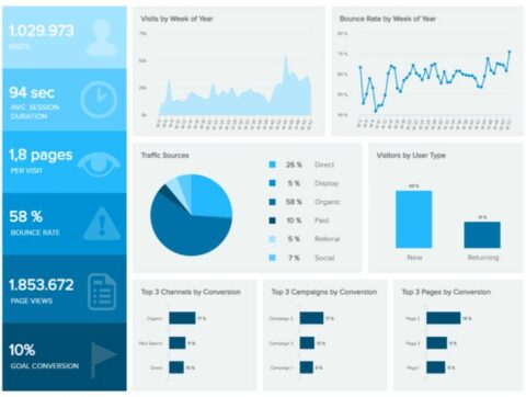
AI SEO Data Visualization is the process of using artificial intelligence to analyze, interpret, and graphically display search engine optimization metrics. Unlike traditional dashboards that simply plot historical data, this advanced method leverages predictive analytics and natural language processing to highlight anomalies, forecast trends, and suggest corrective actions. The core objective is to reduce cognitive load, allowing marketers to grasp the health of their digital presence at a glance rather than spending hours parsing CSV files.
The technology works by ingesting massive datasets—including click-through rates, dwell time, SERP features, and entity relationships—and then applying clustering algorithms to group related keywords. The output is a dynamic visual interface where nodes, heatmaps, and line graphs reveal the interconnectedness of ranking factors. For example, a scatter plot might show that pages with higher topical authority (measured by internal link density) consistently outperform pages with more backlinks, a correlation that is nearly impossible to spot in a tabular format.
The Core Components of AI-Driven SEO Dashboards
To fully leverage this technology, one must understand its fundamental building blocks. A robust AI SEO data visualization system typically comprises four distinct layers that work in concert to deliver a holistic view of search performance.
1. Predictive Trend Lines and Forecasting
Traditional analytics show what happened in the past. AI-powered visualization extends this by projecting future performance based on seasonality, algorithm update cycles, and competitor velocity. These predictive trend lines are often displayed as dashed extensions of solid historical curves, giving SEO teams a forward-looking perspective. This allows for proactive content refreshes before a seasonal dip occurs, rather than reactive fixes after traffic drops.
2. Entity Relationship Graphs
Search engines now operate on semantic understanding rather than simple keyword matching. AI visualization tools map out entities (people, places, concepts) and their relationships in a network graph. Each node represents an entity, and the connecting lines indicate contextual relevance. This visual structure helps content strategists identify gaps in topical coverage. If a graph shows strong connections between “vegan protein” and “amino acid profile” but a weak link to “digestibility,” that signals a content opportunity.
3. SERP Feature Heatmaps
Google’s results page is no longer a list of ten blue links. It is a mosaic of featured snippets, People Also Ask boxes, video carousels, and local packs. AI-driven heatmaps visualize where these features appear for target keywords. The visualization uses color intensity to show the frequency of a feature’s appearance. A high-intensity red block for “image pack” on transactional queries indicates a need for optimized alt text and high-resolution visuals to capture that real estate.
4. Anomaly Detection Scatter Plots
Sudden drops in rankings are often the first sign of a technical crawl error or a manual penalty. AI algorithms excel at detecting outliers in data. Scatter plots generated by these systems highlight data points that deviate significantly from the expected pattern. A cluster of red dots on a graph representing “indexed pages” might indicate a soft 404 issue that is silently bleeding crawl budget. This immediate visual flag enables rapid technical audits.
Key Benefits of Using AI for SEO Reporting
The integration of artificial intelligence into data visualization offers tangible advantages that go beyond aesthetic appeal. These benefits directly impact workflow efficiency and the bottom line of digital marketing campaigns.
- Speed of Insight: AI processes millions of data points in seconds, generating visual summaries that would take a human analyst days to compile. This speed allows for real-time adjustments to SEO strategy.
- Pattern Recognition: Machine learning models identify non-linear relationships between variables. For instance, they can visualize that the impact of page speed on rankings is negligible until load time exceeds 2.5 seconds, at which point the correlation becomes exponential.
- Stakeholder Communication: Executives rarely have time to read detailed reports. A well-designed AI visualization dashboard translates technical jargon into universal business language, making it easier to justify budget allocations for SEO initiatives.
- Automated Segmentation: AI automatically groups keywords by search intent (informational, navigational, transactional) and visualizes performance by segment. This removes manual filtering bias and ensures that all data is considered.
- Ignoring Data Quality: Feeding the AI system with incomplete or dirty data (e.g., missing GA4 event parameters) results in misleading visualizations. The principle of “garbage in, garbage out” applies strictly here.
- Overcomplicating the Dashboard: Trying to visualize every single metric on one screen creates visual noise. A dashboard with 50 different chart types is less actionable than one with five focused graphs that answer specific business questions.
- Confusing Correlation with Causation: AI might visualize a strong correlation between bounce rate and rankings, but that does not mean bounce rate causes ranking changes. Marketers must use the visualization as a starting point for deeper investigation, not as a definitive answer.
- Neglecting Mobile View: Many dashboards are designed for desktop viewing. If the visualization is not responsive, mobile users will see truncated graphs, leading to misinterpretation of the data.
AI SEO Data Visualization vs. Traditional Reporting
Understanding the distinction between conventional dashboards and AI-enhanced visualization is critical for adoption. The differences are not merely cosmetic; they represent a fundamental shift in how data is processed and presented.
| Feature | Traditional SEO Reporting | AI SEO Data Visualization |
|---|---|---|
| Data Processing | Historical, static, manual aggregation | Real-time, predictive, automated analysis |
| Insight Generation | Human interpretation of tables | Machine-generated anomaly alerts and recommendations |
| Visual Complexity | Simple line graphs and bar charts | Interactive network graphs, 3D surface plots, and dynamic heatmaps |
| Scalability | Limited to a few hundred keywords | Handles millions of keywords and URLs simultaneously |
| Actionability | Requires manual hypothesis testing | Provides prescriptive actions based on predictive models |
The table above illustrates that while traditional methods are useful for basic tracking, they lack the depth required for competitive advantage. AI visualization turns data into a decision-support system rather than a historical record.
Practical Applications: How to Use AI Visualization in Daily SEO Work
Implementing this technology requires a strategic approach. It is not enough to purchase a tool; teams must integrate the visual outputs into their daily workflows to drive meaningful change.
Keyword Clustering and Content Gap Analysis
Use AI-generated topic maps to visualize the semantic distance between keywords. These maps often appear as a solar system model, with the core topic as the sun and related subtopics as orbiting planets. By examining the orbital distance, content managers can identify which subtopics are underserved. If the “planet” representing “link building for ecommerce” is far from the sun but has high search volume, that is a clear content gap to address.
Competitor Benchmarking with Overlay Charts
AI tools can overlay your domain’s visibility curve against that of three major competitors on a single graph. The visualization uses shaded confidence intervals to show where your data is statistically significant versus where it is just noise. This helps prioritize battles. If the overlay shows your competitor’s curve spiking on “long-tail question keywords” while yours is flat, the visual evidence supports a shift toward FAQ-style content.
Technical SEO Audit Prioritization
Instead of a linear list of crawl errors, AI visualization presents a bubble chart where the size of the bubble represents the number of affected URLs and the color represents the severity (red for critical, yellow for warning). This allows technical SEOs to immediately focus on the largest red bubbles, such as a sitewide pagination issue, rather than getting bogged down in minor 404s on archived pages.
Common Mistakes in AI SEO Data Visualization
Adopting this technology is not without pitfalls. Many teams fail to realize the full potential of their tools due to common implementation errors that skew the visual output.
Important Notes for Implementation
Before integrating AI SEO data visualization into your stack, consider these critical factors to ensure a smooth transition and accurate outputs. First, ensure your data sources are connected via APIs (Google Search Console, Ahrefs, Semrush) to allow for seamless data flow. Manual CSV uploads defeat the purpose of real-time AI analysis.
Second, establish a clear hypothesis before generating visualizations. AI is excellent at confirming or denying a hypothesis, but it is not a mind reader. If you want to know if “content length affects rankings,” configure the visualization to specifically plot word count against average position. Third, invest in training. The best visualization tool is useless if the team does not know how to read a chord diagram or a Sankey flow chart. Allocate budget for upskilling staff on data literacy.
Frequently Asked Questions
What is the best tool for AI SEO data visualization?
T However, leading platforms include Looker Studio (with AI add-ons), Tableau (with machine learning integrations), and specialized SEO tools like Semrush’s “Trends” and Ahrefs’ “Dashboard 2.0”. For custom solutions, Python libraries like Plotly and D3.js combined with Scikit-learn offer unlimited flexibility for building bespoke AI-driven visualizations.
How does AI improve SEO data visualization compared to manual methods?
AI improves the process by automating the detection of patterns that the human eye cannot see. It can process multi-dimensional data (e.g., user location, device type, time of day, and query length) simultaneously and project these onto a 2D or 3D space. This reveals hidden clusters and outliers. Manual methods rely on pre-defined dimensions, which often miss these subtle but crucial insights.
Can AI SEO data visualization predict Google algorithm updates?
AI cannot predict the exact content of a Google update, but it can predict the impact of volatility. By visualizing the “temperature” of the SERPs—measured through rank tracking data across thousands of keywords—AI models can detect unusual fluctuations that often precede a broad core update. This gives SEO teams a warning to avoid making drastic changes to their sites during that volatile period.
Is AI SEO data visualization suitable for small businesses?
Yes, but with a caveat. Small businesses with limited keyword portfolios (under 500 keywords) may not see immediate value from complex AI models. However, using AI-powered visualization for competitor analysis and content gap identification can level the playing field. Free tiers of tools like Google Colab can run basic clustering algorithms on small datasets, making this technology accessible even with minimal budget.
Conclusion
AI SEO Data Visualization is not a luxury; it is a necessity for teams that want to remain competitive in an increasingly complex search ecosystem. By transforming raw, chaotic data into structured, predictive, and interactive visuals, this discipline empowers marketers to make faster, more accurate decisions. The shift from static reporting to dynamic, AI-driven insight is the defining characteristic of modern SEO maturity. Those who embrace this technology will not only understand their current rankings but will also anticipate future shifts, allocate resources efficiently, and ultimately achieve sustainable organic growth. The future of search marketing is visual, and the time to adopt this intelligence is now.
Xem thêm:
- AI SEO Semrush: The Complete Guide to Automating Your Search Rankings in 2025
- AI SEO Accessibility: The Complete Guide to Inclusive Search Optimization
- AI Grammar Checker: Transform Your Writing with Intelligent Error Detection
- AI SEO AI Search Citations: The Complete Guide to Winning AI Search Visibility
- AI SEO Lazy Loading: The Complete Guide to Faster Sites and Higher Rankings
Bài viết cùng chủ đề:

AI SEO SEO Automation with Make: The Complete Workflow Guide

AI SEO SEO Automation with Zapier: The Complete Workflow Guide

AI SEO SEO Automation with n8n: The Complete Workflow Guide
AI SEO SEO Automation with Gemini: The Complete Guide to Scaling Organic Growth

AI SEO SEO Automation with Claude: The Complete Guide to Scaling Content in 2025

AI SEO SEO Automation with ChatGPT: The Complete Playbook for 2025

AI SEO & SEO Automation for Affiliate Sites: The 2025 Playbook for Passive Income Growth
AI SEO & SEO Automation for Bloggers: The Complete Guide to Scaling Your Content

AI SEO & SEO Automation for Agencies: The Complete 2025 Playbook

AI SEO and SEO Automation for Ecommerce: The Complete Playbook for 2025

AI SEO & SEO Automation for WordPress: The Complete Playbook for 2025
AI SEO SEO Automation Strategy: The Complete Playbook for 2025

Mastering the AI SEO SEO Automation Process: A Complete Guide to Scaling Organic Growth
AI SEO SEO Automation System: The Complete Guide to Scaling Organic Growth in 2025
AI SEO SEO Automation Platform: The Complete Guide to Scaling Organic Growth in 2025
AI SEO SEO Automation Software: The Complete Guide to Scaling Organic Growth in 2025